2026-06 · Designer & Developer
Corporate Site
Building flarely.co.jp on Astro 5, React 19, Tailwind, and shadcn/ui. A WebGL grain-gradient shader, a GSAP pin-based horizontal services scroll, and a three-page structure (Top / Privacy / Terms) — all in service of one goal: lowering the barrier to reach out.
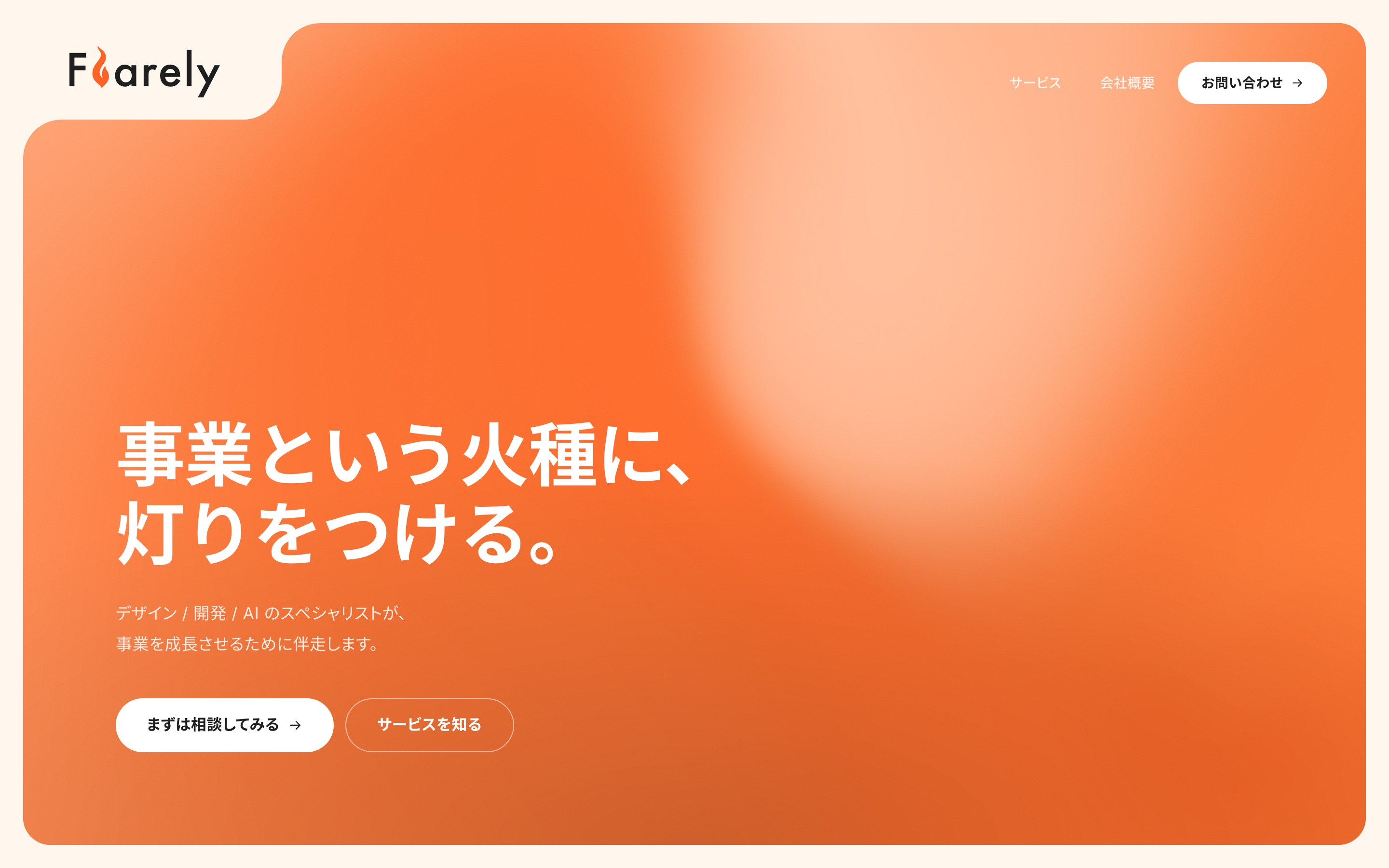
One goal: lower the barrier
Flarely walks alongside small and mid-sized businesses across Kanagawa and Tokyo. The studio’s offer is “it’s okay if your service is still fuzzy” — and the site has to make that feel true.
Everything else was reverse-engineered from there:
- Page count: as low as possible. Three pages — Top / Privacy / Terms
- No standalone
/contact. The contact form lives inside Top at#contact - The hero copy: “Light a fire under your business.” (
事業という火種に、灯りをつける。) - The subhead: “Design / Engineering / AI specialists, walking alongside your business as it grows.”
A standalone /contact page implies “this is a formal inquiry.” We wanted the feeling of scrolling all the way down and finding a form there.
Stack
| Layer | Choice |
|---|---|
| Framework | Astro 5 |
| UI | React 19 + Tailwind v3 + shadcn/ui |
| Animation | GSAP (ScrollTrigger pin) |
| Visual | @paper-design/shaders for a WebGL grain-gradient |
| Form | shadcn (input / textarea / label / select) + Radix |
| Package | pnpm |
The shader started as a paper-design/shaders MeshGradient layered with feTurbulence film grain. It fought the FV copy too aggressively. After tuning, we landed on speed: 0.7, mix-blend-overlay, opacity 0.22 — just enough motion to suggest “the tinder is still alive.”
Horizontal services scroll
The six services slide horizontally on desktop via GSAP pin + ScrollTrigger. The math for the slide distance — offsetLeft + paddingLeft — is tuned so the last card’s right edge lines up exactly with the wrap’s right edge.
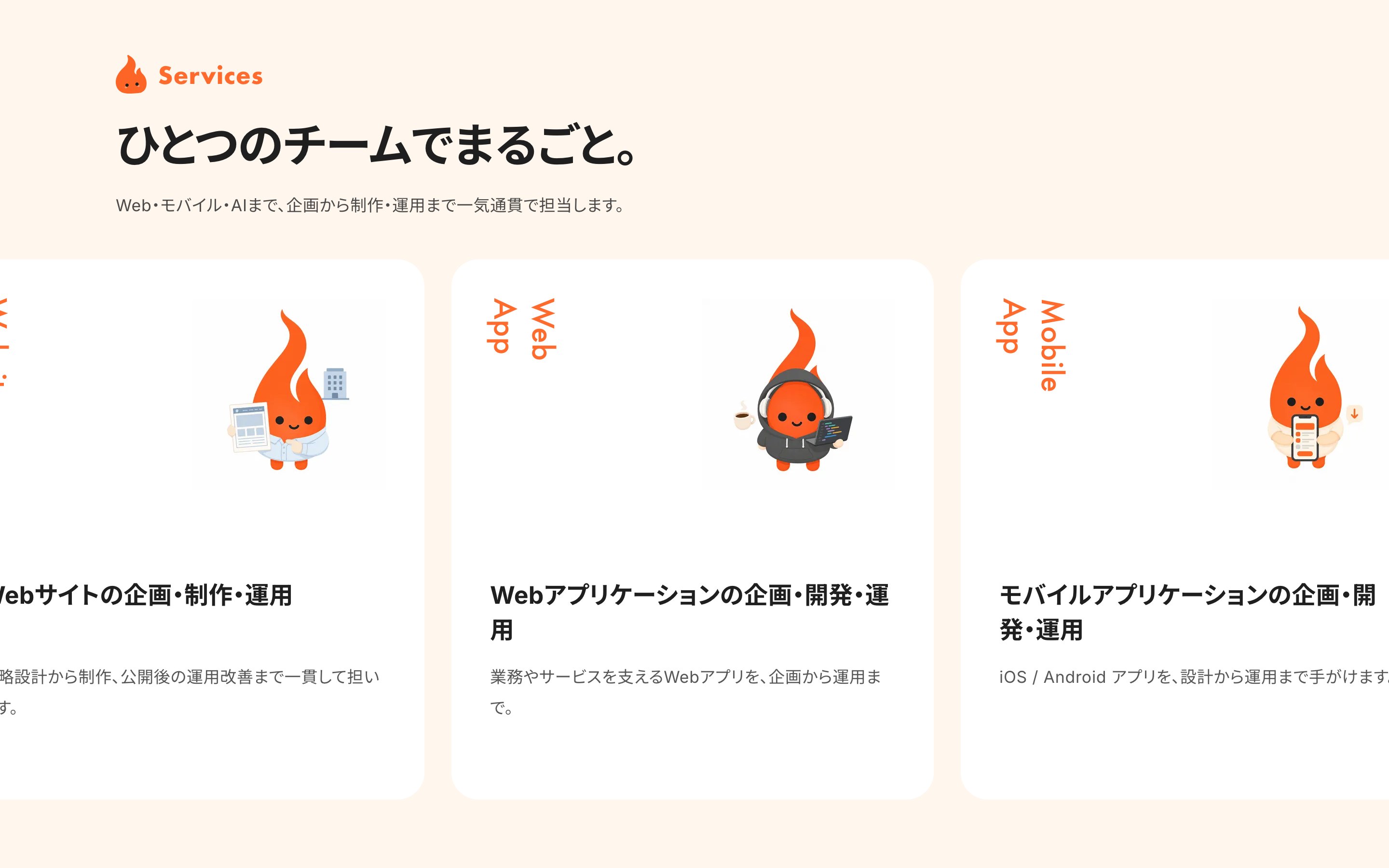
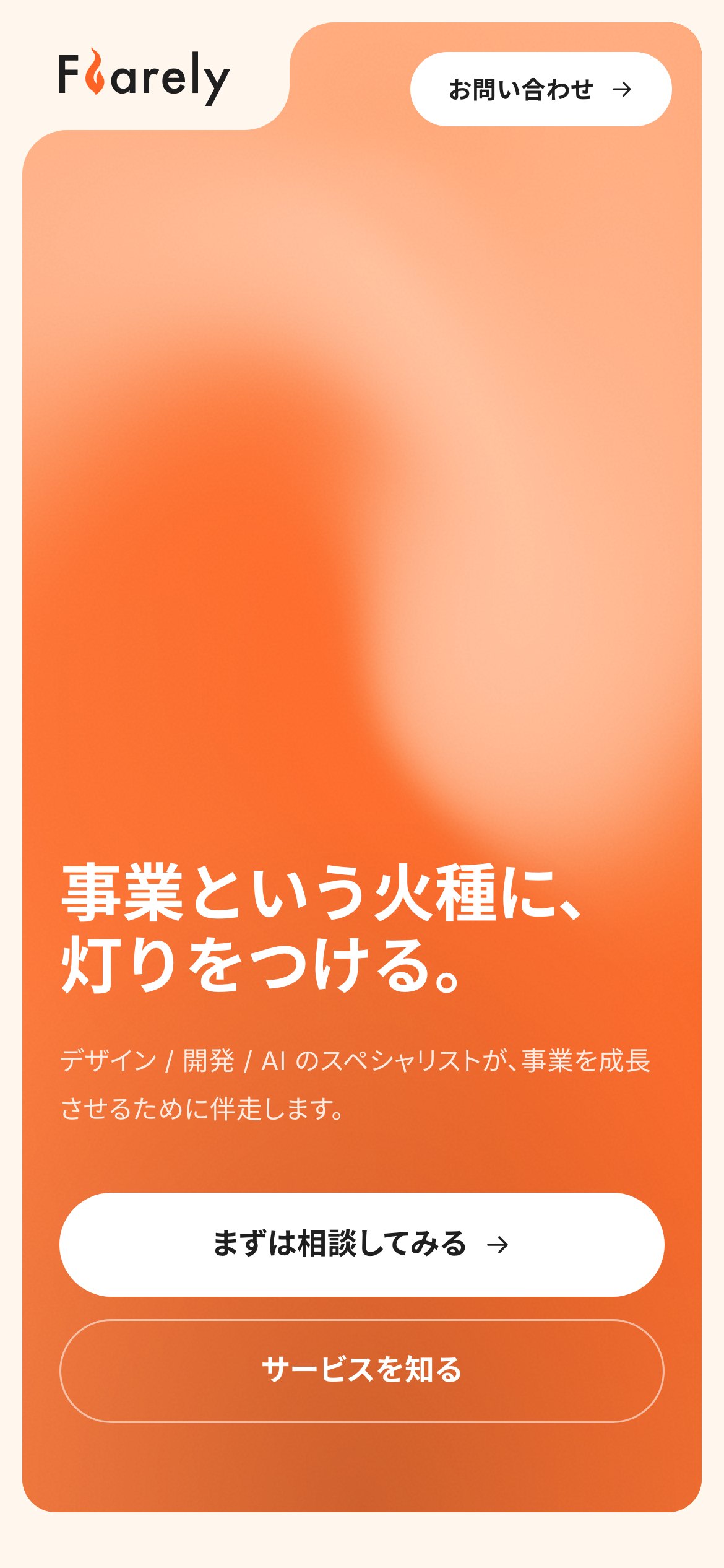
On mobile, the same six become a vertical one-column stack. Same information, only the eye’s path changes.

A consistent header
The headers on the sub-pages (Privacy / Terms) match the Top FV header exactly — position, size, and color. sticky, border-b, and backdrop-blur were intentionally dropped to keep the header behaving like a transparent, weightless layer.
- Absolute position
left-0 top-0/right-4 sm:right-6 lg:right-10 - Height
h-[58px] sm:h-[100px] - Wordmark
h-[32px] sm:h-[54px] - CTA inverted on sub-pages: graphite background, white text
I wanted the feeling of “you’ve moved to another page” to be as quiet as possible. The header not flinching was the top priority.
Tried and dropped
- A sticky
position: fixedheader — collided with downstream sections; reverted to the FV-embedded version - A 5-page multi-page structure (Top / Services / Works / Company / Contact) — information density diluted; collapsed to 3 pages
- The earlier hero copy “From building to running.” — resonant, but a bit industry-coded; replaced with “Light a fire under your business.”
You can only sharpen “what to keep” after seeing “what was extra.”
Takeaway
Aiming the whole site at a single goal — lower the barrier to reach out — made every downstream decision (structure, copy, header, shader, form width) snap into place. Once the brand statement is locked, site decisions move at roughly twice the speed.